twecoll on my Graph

Photo by rosipaw
As some of you know, I enjoy the use of Twitter as a way to learn about new ideas. People use it in all sorts of ways though: sharing moods, broadcasting about their organization (old-style broadcasting), conversing or sharing links and thoughts. Once you join, you seek out some people to follow. Twitter, unlike Facebook or LinkedIn is a directed network. You can follow someone without having them follow you in return. The great thing is that your graph data is relatively easy to obtain thanks to Twitter’s API.
I still like to digest my Twitter timeline (collection of my friends’ statuses) “manually” i.e. browsing through it usually on my mobile device. Once you start following a significant number of friends, this task becomes more difficult. Furthermore, depending on how you select Twitter friends, you end up in what has been called a Filter Bubble.
Can social network analysis help identifying that echo effect? What other indicators can be extracted from Twitter to help assess the quality of a graph? I’ll use Twecoll and my recent leanings from the Coursera SNA course brilliantly delivered by @ladamic.
Obtaining Data
twecoll is a Twitter data collection tool initially created to backup my tweets and favorites. It’s hacked in Python and can certainly use some pythonista love. It has a command-line interface as I usually ‘grep’ through these backup files for keywords. It has been significantly extended for the purpose of my SNA class to generate a Gephi and igraph compatible network file. The common format selected is GML.
Below is a simple example using my friend’s @oazanon graph. He’s relatively new (read: inactive) on Twitter and the is quick to obtain. The tool collects graph data in two steps. First, I retrieve the handle’s friends using the init command. The second step uses fetch and retrieves the friends of each entry in the oazanon.dat file. Finally, edgelist constructs the oazanon.gml file containing edges, vertices and their attributes. The last command also generates a canned graph file using a circular layout and weak clustering.
$ twecoll init oazanon
$ twecoll fetch oazanon
$ twecoll edgelist -w -l circle oazanon
Oscar’s network is still in early stages of development and is shown below. Edges indicated which of his friends are following each other.

As a comparison, I downloaded the data of my @jdevoo network using the same two steps, init followed by fetch. For the representation of my graph, I used Kamada-Kawai as layout method.
$ twecoll edgelist -l kk jdevoo
Data Analysis
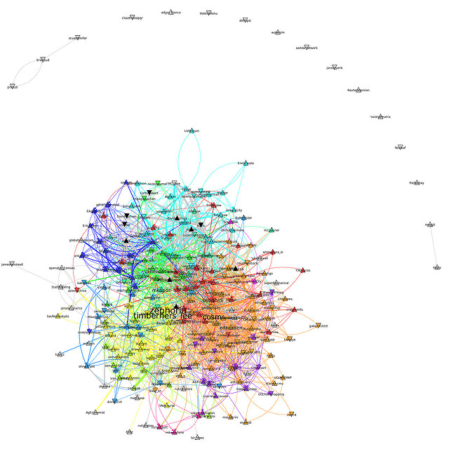
The picture above shows all my friends on Twitter, i.e. people I follow. Each node is represented as a triangle. It points up if that particular friend has more followers than friends, otherwise the triangle points down. Black triangles represent nodes skipped by Twecoll. This can occur if they have more than the 5000 friends (configurable) or if the account is private.
Edges between any two friends are directed (A->B A follows B) and their width is proportional to the average number of tweets per day sent by the target (B or friend’s friend) since they joined Twitter.
Finally, Twecoll uses igraph to apply igraph’s InfoMap community detection algorithm (Rosvall and Bergstrom) and colors the friends accordingly. An edge A->B is colored according to the membership of B, the friend they follow.
Twecoll generates a .gml file which can be processed by igraph directly. In the example below I open the file and store it in g. I ask myself then how many of my friends have an indegree greater or equal to 30 using the select capability provided by igraph.
In [1]: g=read('jdevoo.gml')
In [2]: [v['label'] for v in g.vs.select(_indegree_ge=30)]
Out[2]: ['edborden', 'mkapor', 'cosm', 'timberners_lee', 'zephoria',
'ushahidi']
These names are visible on the visualization as they are represented in a font size proportional to the indegree. I can use igraph to find out if any of these names have a high betweenness (no. of shortest paths passing through). For that, I first look at the betweenness values of the top 10 friends and find the value 2000.
In [3]: sorted(g.betweenness())[-10:]
Out[3]: [2008.1764887801157, 2056.137109067738, 2156.656233632777,
2158.147091804009, 2388.9593509739343, 2847.0132522809213,
2940.295444262411, 3360.532222150746, 3813.0189770792294,
4085.8280714272855]
I then round the lowest value for my select statement to find those friends with betweenness greater or equal to 2000:
In [4]: [v['label'] for v in g.vs.select(_betweenness_ge=2000)]

Out[4]: ['sinanaral', 'openworld', 'jhagel', 'epaulos', 'cosm',
'gfriend', 'trecedejunio', 'zephoria', 'phisab', 'postscapes']
Interpretation
Based on the top indegree friends I follow (Out[2]) and the list of high betweenness friends (Out[4]) I will most likely unfollow @timberners_lee and trust my 30+ friends who follow him already to retweet his statuses. I will keep @zephoria and @cosm for now as I enjoy reading their tweets even though more than 30 friends already follow them.
The graph can be generated with transparent (hidden) edges.
$ twecoll edgelist -t -l kk jdevoo
The incident arrows of edges still show creating a halo effect around my friends. The color of the arrow corresponds to the membership of the vertex it points to (i.e. follows). As expected, high indegree vertices show a full halo effect with many inbound arrows. The effect also shows which friends are slowly but surely completing their halo. They indicate I am following more and more friends in that domain and might consider balancing out to avoid potential echo effects.
Another interesting observation comes from the origin side of the edge between two given friends. The picture below shows a portion of the graph with the edges visible.
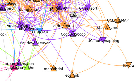
Notice how @UCLnoisemapping follows (outbound edges) 3 other of my friends in two different communities (orange and purple). This reflects the fact this particular vertex reads tweets originating from two domains namely Smart Cities / UbiComp and Citizen Science. Diversification is good! The domains are identified through InfoMap. InfoMap takes advantage of the weights on vertices and edges in a connected graph. Twecoll assigns a rank to each edge corresponding to the order in which A befriended B. Recent friendships have higher weight as they correspond to recent interests. Vertices are weighted according to the number of times a user was listed by others on Twitter. Lists are often used by Twitter users to categorize experts in a given domain. It also allows a user not to grow its friendship count while having quick access to certain domain experts.
You may have noticed how some friends are colored in gray. That indicates they are not part of the giant (largest) component isolated by igraph. This is required for the use of InfoMap. The composition of the giant component varies according to the mode used. By default Twecoll searches out strongly connected components in which all the vertex pairs must be reachable from each other (i.e. vertex A must be reachable from B and vice versa). If edgelist is invoked with the —weak option, it can happen that vertex A is reachable from B but B is not reachable from A. Members which are not part of the giant component can be very interesting and deserve careful examination. They do not belong to any of my current domains of interest and can become pathways to serendipitous learning.
Conclusion
This very simple analysis could be enhanced with additional insights from the tweets, the avatar images, geographical locations or profile descriptions. But it might already have teased your appetite for knowledge about the fascinating science of networks.
References
Multilevel compression of random walks on networks reveals hierarchical organization in large integrated systems, M. Rosvall, C. T. Bergstrom, arXiv:1010.0431
 This material is licensed under CC BY 4.0