Eyes on the Hood
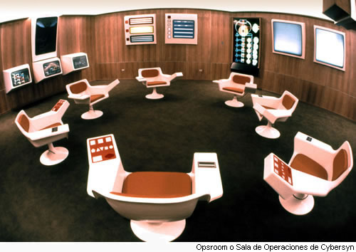
Source: Cybersyn Ops Room Chile Primero
The picture above dates back to the early seventies. It represents a room from which Salvador Allende’s CORFO team (state agency in charge of nationalizations) could keep an eye on their hood: Chile. A country that stretches the southwestern coast of South America with (back then) seven million inhabitants, health care and education sub-systems, an undergoing agrarian reform and newly nationalized industries. The room situated in Santiago, was designed to empower officials with tools designed to sense, understand and respond to disturbances in their neighborhood systems. It contained the following elements:
- 7 tulip chairs with an ergonomic control panel, place for a drink, ash tray (in gray)
- an organizational model which represents the 5-tiered system with its operations, the meta-system governing them and its environment (in green)
- an indexed infographics browser including processes and material flows using Sankey diagrams to understand manufacturing processes (in blue)
- a filtered feed of data obtained through cybernet, an ad-hoc network of telex machines, providing key performance indices represented by trend arrows rather than raw figures or time series (in red)
- a system dynamics model of the Chilean economy capable of simulating alternative scenarios (in yellow)
That room, with its StarTrek dashboards and underlying recursive design, was intended to equip CORFO’s officials with enough variety to cope with the nationalization challenge and governance complexity of Chile at the start of the seventies.
Now, fast forward to 2012 with 26 sovereign states facing a presidential election. Many officials will be facing increased variety in a flat world with consistent inability to curb environmental trends related to man-made global warming, ailing health care systems and an economic crisis raising doubts about the engine sustaining today’s economies… What sort of situation room will they be using to avoid running their hoods into chaos? To narrow the question for my simple blog, I interested myself in the last 3 items of the above list in the context of modern ICT. What do modern information dashboards look like? What is the current state of sensor networks for real-time monitoring? How do we apply models for testing assumptions in complex environments?
Susty Dashboards and Infographics
As perpetual student of sustainable development, I keep an eye out for dashboards with social, economic or environmental indicators. These cover issues such as local food sources, energy, biodiversity, mobility, social stability, material flows, water, population, emerging conflicts, or urban zoning. Below is a short list of examples. Some are self-updating dashboards, others visualization tools responding to canned queries. The term indicator here refers to the confrontation between an actual measure and some agreed standard, e.g. actual vs. year-to-date or actual vs. target.
- Google Gapminder represents development time series for all countries and regions of the world
- Breathingearth is a simulation of population births and deaths as well as CO2 emissions across the world
- newsmap treemap view of Google News by Marcos Weskamp
- IBM CityForward provides access to urban development trends and visualizations
- In The Air visualization of microscopic and invisible agents of Madrid’s air
- UNICEF Urban Population Map countries and territories with 2050 urban population above 100.000 souls
MillenniumSustainable Development Goals Dashboard tool to assess progress towards sustainable development- Citizen Mobile Environmental Sensing citizen sensing air quality data on a map
- CityDashboard London aggregate of simple spatial data for London
- Swiss Federal Sustainability Cockpit Swiss sustainable development dashboard
- City Eco Lab dashboard local energy dashboard (prototype)
- EveryAware WideNoise crouwdsourced soundscape map
- US Federal FleetDASH US Federal agencies’ fleet fuel consumption, greenhouse gas emissions, and vehicle inventories
- Climate Change and African Political Stability dashboard information on four sources of vulnerability: physical exposure to climate-related hazards, population density, household and community resilience, and governance and political violence
- earthdashboard alpha version of a tool that intended to provide a unitary, global perspective on the real-time condition of our world
- CO2 Scorecard grades, evaluating the effectiveness and efficiency of Switzerland in meeting CO2 reduction targets
- Energy Shortages Ushahidi map of crowdsourced power outages around the world
- IBM Intelligent Operations Center for Smarter Cities (video)
- Air Quality Egg crowdsourced data on air quality with dashboard currently hatching
- Sensores Ciudadanos (Citizen Sensors in Spanish) is collecting funds to implement a dashboard
- Urban Dynamics Jay Forrester’s classic simulation of the migration and movement of three socioeconomic classes in a city (while other examples focus on here-and-now, I wanted to include an example of there-and-then which is best shown with simulation dashboards such as those found in system dynamics)
- Sourcemap upstream and downstream logistics maps to visualize supply chains
This list shows already a rich variety of possibilities with stunning visualizations, real-time sensor feeds, econometric data representation, simulation, data crowdsourcing among other characteristics. Most of these sites are designed to raise awareness but could equally be referenced during design sessions.
Designing Dashboards
When it comes designing dashboards, Stephen Few of perceptual edge is a name that rapidly stands out. He inspired many information architects and published resourceful books for anyone interested in designing effective dashboards. Effective how? For one, the information displayed is the one that’s actually needed. The data used is not distorted and can be interpreted within required time frames and leave some time for the observer to adapt. Finally, that it adheres to established usability guidelines – see ISO 9241-11 or ISO 9241-12.
Few defines a dashboard as a visual display of the most important information needed to achieve one or more objectives; consolidated and arranged on a single screen so the information can be monitored at a glance. The definition could also be extended to incorporate the notion of alerts which remains one of the key capabilities of a solution that would enable responsive handling of environmental changes. Before undertaking any design, one would first scope the requirements. That includes defining the following items: domain (water, energy, mobility, social equity, economy, etc.), purpose (collaborate, analyze, monitor), reach (strategic, tactical, or operational and roles), and scale (world, region, nation, city, neighborhood). Existing principles are very useful to know going into a scope. In the case of national sustainable development dashboards for example, the Bellagio Principles served as initial guideline for defining what to monitor and evaluate. Many countries have used it as starting point to define their indicators.
Gathering the dashboard requirements will help outline the solution architecture. They cover both functional and non-functional requirements driven by: data (quantitative, qualitative data); integration incl. sources of data (databases, sensors, mobiles), producer push/pull, consumer push/pull, etc.; indicators (general or specific); trust i.e. data accuracy, provenance, security; interaction: static, interactive; lifespan: data displayed by month, day, hour, minute, etc. and retained for how long; triggers including alerts via audio, SMS, e-mail, Twitter, etc.; simulation: system dynamics or agent-based modeling (see third section); visualization and graphs, icons, text making up the dashboard and finally the user experience for the chosen device(s) e.g. mobile, tablets or 10-foot UI.
Gestalt Laws
Experienced designers leverage best practices, patterns and their experience to avoid designing dashboards with too much clutter and indicators no one understands. The Gestalt laws of perceptual organization are an example of best practices when consolidating and arranging information on the dashboard. These include
- Prägnanz
- simple shapes stand always out
- Similarity
-
grouping of similar things
- Proximity
- our eyes tend to group nearby objects on the dashboard
- Continuity
- smoothest path among dots stand out
- Closure
- groups are perceived as wholes
- Synchronicity
- causal relation between events, e.g. alerts
The selection of fonts, colors, icons also adhere to best practices, e.g. consider sequential color palettes over rainbows which are harder to read for color blind users. A nice example was presented by Thomas Goetz at TEDMED. He showed how designers were able to make some bold calls to redesign the dull blood test results into something more insightful for both patients and doctors. Perhaps you know of other examples more specific to dashboard design…
From Telex To UbiComp
Dashboards need data. Lots of it. While Cybersyn relied on Cybernet, hundreds of telex machines to gather data, advances in ICT allow us to access data not just from enterprise systems but also from sensors and mobiles used in all sorts of environments. Take the city of Santander (Spain) for example. SmartSantander involves the design, deployment and validation of a platform composed of sensors, actuators, cameras, mobile terminals, etc. integrated under the umbrella of the so called Internet of Things also known as UbiComp. The city has the ability to sense and transmit information about temperature, air pressure, noise level, CO2 concentration, or free parking spaces. Another project, EkoBus, has seen sensors deployed in the cities of Belgrade and Pancevo. Their system uses public transportation vehicles to monitor a environmental parameters over a large area as well as to provide additional information for the end-user like the location of the buses and estimated arrival times to bus stops.
A specialized back-end solution is required to handle the amount of data gathered by large number of sensors and populate dashboards adequately. Some organizations such as Cosm, Pacific Controls with its Galaxy product, or AMEE with AMEErealtime are specialized in this part of the ops room architecture. Currently, Cosm stands out among the open hardware aficionados and citizen sensors. It is the main sponsor of the Air Quality Egg project, a crowdsourced air quality initiative. Another platform which was designed to cope with many smart meters was EU’s Digital Environment Home Energy Management System or DEHEMS. Funded under EU’s FP7, DEHEMS explored the use of technology to improve the efficiency of domestic energy use.
Cybernet Revisited
DEHEMS recently reached its final milestone leaving a library of interesting publications including this meter and network plan. The document reveals some elements of their architecture which includes two tiers between the service endpoints and the time series database storing sensor data (Fig. 4, p. 8). The DEHEMS project uses an Informix database with a time series blade to handle part of the sensor data. It is possible to learn from other open projects as well. One of them is MQTT. It’s IBM’s Internet of Things protocol which has been open sourced and has a growing list of client and server implementations. MQTT is part of a wider mediation solution (IBM WebSphere MQ Telemetry) based on queueing which has already been tried and tested in industrial control environments.
Another organization heavily involved with sensor networks is the distributed informations systems laboratory at the EPFL in Lausanne. LSIR published a paper on the TimeCloud architecture, a platform designed to manage large-scale time series in the cloud. The solution makes use of HBase to manage data persistence and includes a data filter based on timestamps, an incremental fetcher and a model-based data approximation mechanism to evaluate relevant data points in the subsets.
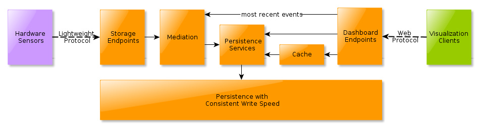
The open source world has also some interesting contributions to the problem of collecting events, store them as time series and support their visualization. One such project is Graphite, a Python-based round-robin database (Carbon) and a dashboard solution. Graphite’s design was described by Chris Davis in the Architecture Of Open Source Applications Vol. I. Graphite shares some design elements with the previous solutions: persistence services (whisper), mediation tier to buffer high-speed inbound events (in-memory queues) and front-end caching (memcached). More recently, @davidjacot brought Cube to my attention, a solution based on MongoDB (another NoSQL persistence component) which uses Node.js as front-end for to persistence services. It may evolve into an interesting project for rolling out your own Cosm. The diagram below recaps the main components of a hard-sensing event collection solution with visualization capabilities.
Probing Alternative Scenarios
I wanted to conclude this post mentioning Futuro, the simulation dashboard of the Chilean ops room described above. I believe there’s a contemporary version of Futuro in the works. The OECD Global Science Forum on Applications of Complexity Science for Public Policy identified back in 2008 the need for a socio-economic knowledge collider. Since then, scientists have called for a large-scale LHC-like research initiative on techno-social-economic-environmental issues to study the way our living planet works in a social dimension. That project is FuturICT. While I am not convinced by the overly ambitious scope of this project, there’s something very important behind the need to augment an ops room’s here-and-now gauges with a there-and-then tool to understand our complex environment through models.
I’ll re-frame the question of monitoring our neighborhood for sustainability in terms of closure and risk. Closure is what allows us to isolate a system such as a country from its environment in the first place. A linear reduction of closure, in other words the system’s components enter more and more open-ended relationships which require external action, leads to an exponential increase in risk. A sustainable hood is specified in full through a closed network of sub-system relationships. Effective governance monitors closure while dissipating the risk from the system. The data-gathering infrastructure of hard and soft sensing and its visualization in the ops room represents a first feedback loop. In order for the ops room to really serve the purpose of preserving closure, a second loop is responsible for the learning and feedback. That learning is based on some shared model of understanding. That’s what Futuro is about. Preserving closure takes place in actual discussions in the room balancing the here-and-now data from the ground with here-and-then predictions and alternative scenarios. The outcome being risk dissipation and preserving system closure.
Now, does the simulation model need to be as ambitious as FuturICT? That would depend on the size of the system in focus. What remains certain is that only variety absorbs variety. In other words, the share model of understanding used in the ops room has to be at least as complex as the system it is trying to govern. By complex, I refer to the structural coupling between the underlying sensing infrastructure and identified network of inter-related sub-systems making up the hood and effecting change.
There are still too many open-ended sub-systems out there. Visualizing the loose-ends and restoring closure seems to me like an idea worth attempting…
 This material is licensed under CC BY 4.0